
If Pinterest were a person, I would owe that person big time for basically planning my wedding. I say this often, but it’s worth repeating… I don’t know how people planned weddings before the invention of the internet. I mean, I guess there are wedding planners, but even if coordinating weddings is your job, there is no way it was a simple task in the 80’s. Seriously though, even before Pinterest (what I call The Dark Ages) you had to scan hundreds of wedding blogs for the perfect bits of inspiration, and even then, you were bound to miss an easier D.I.Y. method, or the website offering the cheapest tissue garland. Nowadays, Pinterest is making it too easy to collect your thoughts and ideas, to the point where I wonder, “If I had gotten married even 3 years earlier, what kind of hillbilly hoedown would my nuptials end up being?”
But I digress. I want to do a mini post about my invitations. I’m not ready to come up with a full tutorial type post but I have started printing the addresses on my invite envelopes and I am super excited about how they are turning out. I plan on doing a post after my “Invitation Stuffing Party” (along with a full tutorial) but seeing how the last “party” turned out, I’m sure there will be some sort of mini disaster to sort through when it comes time to actually construct the invitations… soooo, this is like my little “light at the beginning? of the tunnel” before shit starts to really get stressful.
So anyway, I knew exactly how I wanted my envelopes to look before I was even close to deciding on the actual invitations (honestly, I still am not solid on how I want them to look). And here was my inspiration…

Basically, the only reason my invites are going to be on “recycled paper” pocket folds is because of this picture. I loved everything about it. I liked the rustic look of the envelopes, I absolutely loved the font and better yet, I loved the fact that it looked like something I could produce on my own. The best part though is that they looked so professional and in reality, they would probably be really affordable to make!
So the first thing I did was purchase the font... way back in October. This font, called "Mishka", is an "open type" font and basically, in layman's terms, what that means is that the font is really like 3 or 4 fonts in one. Each character has a few different ways is can be shown and you can mix and match the different character styles. In the case for the Mishka font, you could go simple or a few different levels of fancy. For example, notice the different styles of each letter:

You can be simple or add flare to certain letters...


So the reason I bought the font so early on in the game was because I knew it would take some time to individually create each guests address for the envelopes... it definitely took quite a but of patience and time to finish all the addresses. Anyway, enough of the font, I have a strange obsession with typography so I got a bit carried away! You can find the opentype font "Mishka" here for about $29 (including tax).
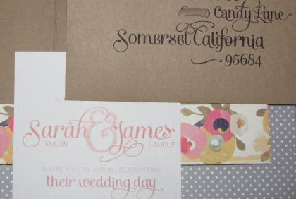
So after I drew up all of the addresses I was super excited to print a few out to see the end result, and here they are...


And since I have purchased a lot of the materials that I will be using on the final invite, I thought I would do a teeny sneak peak...every invitation is going to be a little different but these shots will give you an idea of some of the cute paper I am using!


I am so so excited to put together my invites, I think they are going to look awesome... but first things, first... my save the dates that I ordered should be arriving in the mail any day now and then I'll have even more addressing to do!
yay yay yay.
ReplyDeleteomg. who knew i could get so giddy over a calligraphy font?
they're lovely.
gonna frame mine.